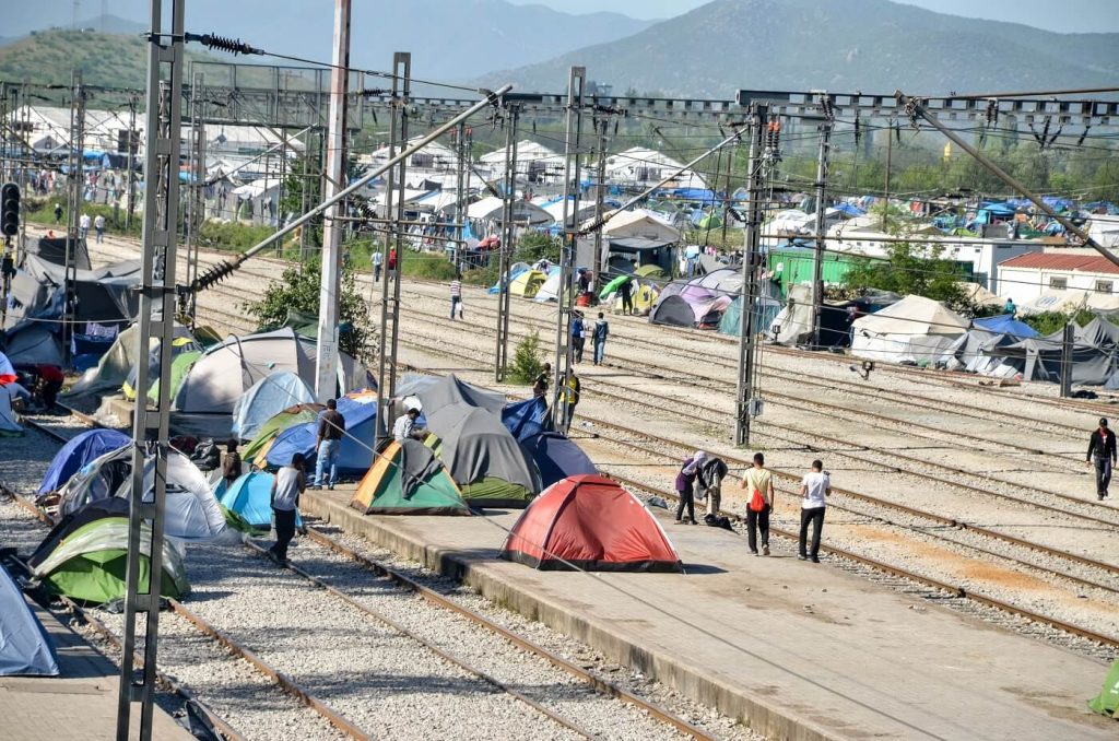
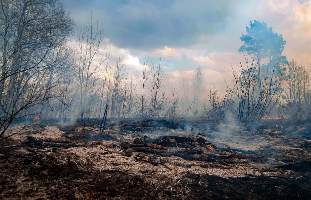
Climigration, or climate migration, is coming. If you get eco anxiety just thinking about it, you’re not alone. Many people in impacted-areas, such as California’s fire zones, are very aware of the fact that they might not be able to raise children or retire where they current reside.
But what will climate migration really look like and when will it occur?
Check out these five different climate migration maps, created by scientists at organizations like NASA, Impact Lab, and others.
These maps will help you predict the future—and prepare for it.
1. Climate Impact Map from Impact Lab

This map from Impactlab.org shows that by 2060 average US temps will be up 4-5 degrees during the summer months. This project is under the criteria of the High emissions(RCP 8.5) with an average probability. Meaning that if carbon emissions do not change this is the most likely outcome.
The majority of the biggest temperature jumps seem to be the mid to upper midwest. If this comes to pass it will cause problems to food production since the majority of our agriculture is centered in the Midwest. Hence why the Midwest is known as “the breadbasket of the US”.
An temperature increase like this could push a lot of smaller farmers out of the industry.This could result in migration east towards the big cities. We already see this in a lot of less developed countries like India. Where farming just isn’t enough to survive on.
Climate Lab is an organization run by economists, climate scientists, data engineers and risk analysts who aim to build the most comprehensive body of research on climate change.
2. NASA supercomputer model 2013: US
This model is more long term. Generated by the NASA Earth Exchange(NEX), a super computer platform at NASA’S Ames research center in California.The computer was fed data by numerous groups. Including NASA scientists, Climate Analytics Group and California State University. Using data as far back as 1950 it has projected the climate in 2090.
Together they collected data in groupings of 800m, roughly the size of a neighborhood. Then ran it through NEX to generate high resolution images. Although this is from 2013 it’s important to compare current projections to projections from almost a decade ago. It helps make sure we are moving in the right direction.
The National Aeronautics and Space Administration(NASA) is America’s civil space program and the global leader in space exploration. Climate Analytics group is a non-profit specializing in climate data services.
3. Consecutive dry days: US
This soil change map from Globalchange.gov shows the change in maximum number of dry days by 2070-2090. Created by comparing data from 1971-2000 it paints a bleak picture for a few spots in the US.
- NorthwestKnown for its rainy cities like Seattle and less so for the sporadic wildfire season; Washington looks to be in trouble if these predictions come to pass. This map shows a 10-20% increase in consecutive dry days. The wildfire season, spanning June through August, causes a lot of damage every year.
According to the Washington Forest Protection Association, in 2021 over 670,000 acres burned. Such a drastic increase in dry days could make the yearly acre total near a million.
- MidwestKnown as the “breadbasket of the US” for its agricultural significance, the Midwest is projected to increase 10-15% in consecutive dry days. A scary projection for the agriculture industry. This further strengthens other separate projections that relate to crop returns. One report stated at least a 10% reduction in yields with the possibility of 20% within the same time period. (LINK TO PILLAR ARTICLE HERE)
The US Global Change Research Program is a federal program mandated by congress. Run by a team of more than 300 experts and guided by a 60 member Federal advisory committee. Its goal is to invest and research understanding the global climate system.
4. Climate 2050: World
Looking for a world wide temperature projection? Look no further. This interactive projection map is at high emissions (8.6) and has some very interesting hot spots. Pun intended
Here Northern Africa/Sahara Desert is projected to experience more heat. Real shocker there. The peculiar part is a different model of the area showing Sahara growth projections shows vegetation taking back a bit of the desert insert link to pillar article. Only time will tell if and what type of vegetation does grow at the edge of the Sahara desert.
Another point to note is that mainly north of the equator and near the north pole are being hit the hardest. With the majority of Asia, Russia and the US increasing by at least 3 degrees(dark red). This may be because they are the top polluters other than India.
Produced by GADM an acronym without a meaning. GADM’s goal is to become a map of all administrative areas with relevant climate information. For them this means “all countries, at all levels, at any time period”.A never ending project. This data is used by numerous colleges including Berkeley, McMaster and the University of California.
5. Sea Level Projection
Created by NASA as part of the Intergovernmental Panel on Climate Change(IPCC) 6th Assessment report. This sea level projection map allows with medium confidence how emissions will affect sea level rise from 2020 to 2100.
Through the process tab you can see how different variables affect the sea level projections. These include Antarctica and glacier melt. You can of course just choose the overall sea level rise like I did. You click on the blue markers to zoom in on that area. From there you will get more precise markers, some of which are individual cities.
Above is Atlantic City in my home state of NJ. This model is predicting that with high emissions the sea level will rise about .43 meters or 1.4 feet by 2050.
The IPCC is a United Nations body that prepares reports on climate change to help the UN make informed decisions. It takes data from all over the world and many sources and distills it to a regulated data set.
If you’re feeling concerned and want to prepare, check out our list of climate migration books, which can help you plan where you might want to move, and when.